. . . See ALL of your Vorne XL(v1) devices on a single screen!
Views and Features
Click on a thumbnail image to see a larger product view.
Production State
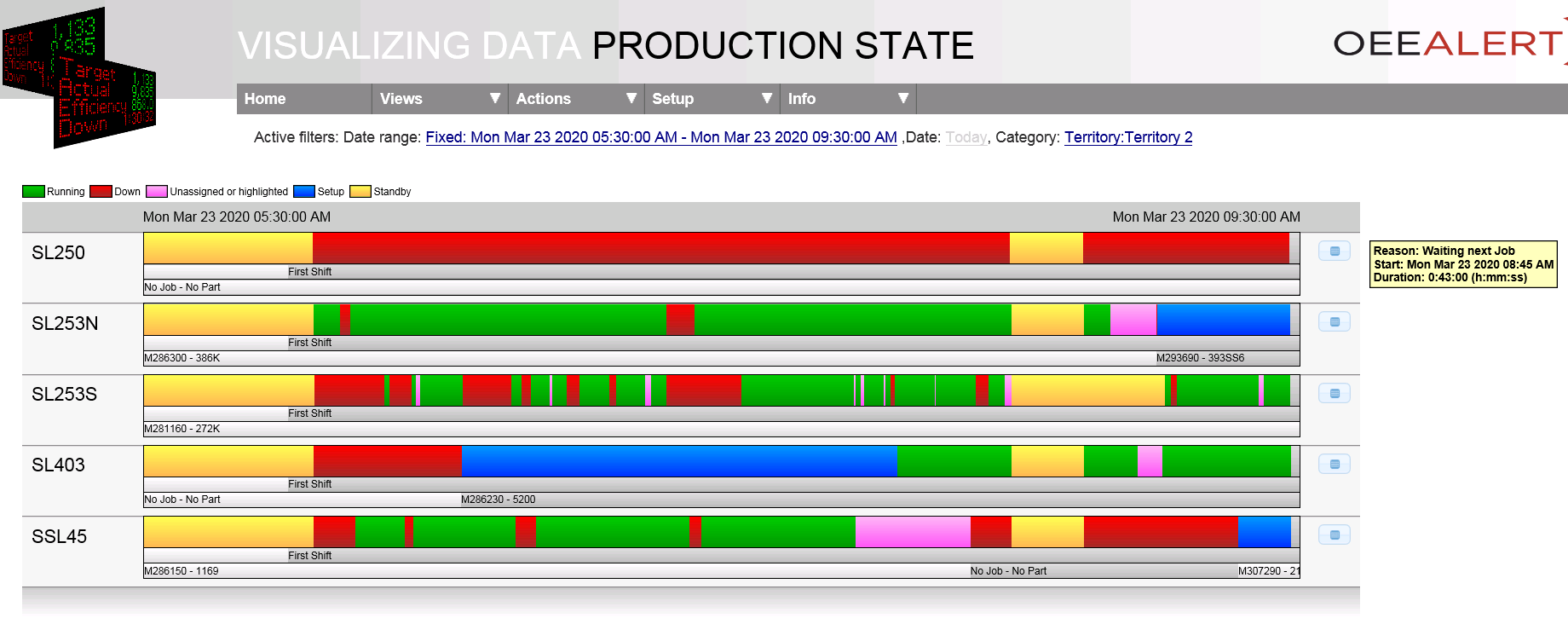
Displays the state progression (run, down, etc.) over time, similar to the Vorne XLv1 Total Production Timeline (TPT) display, but with the added benefit of seeing multiple devices simultaneously.
Hour-By-Hour
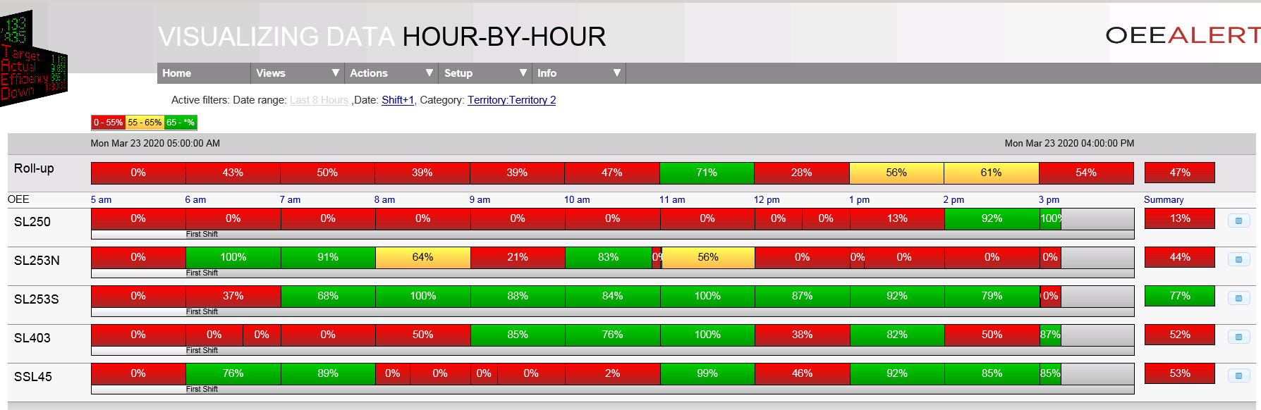
Reflects data for a single day, broken down by short intervals (typically an hour) showing how well an asset performs over time.
Top Losses
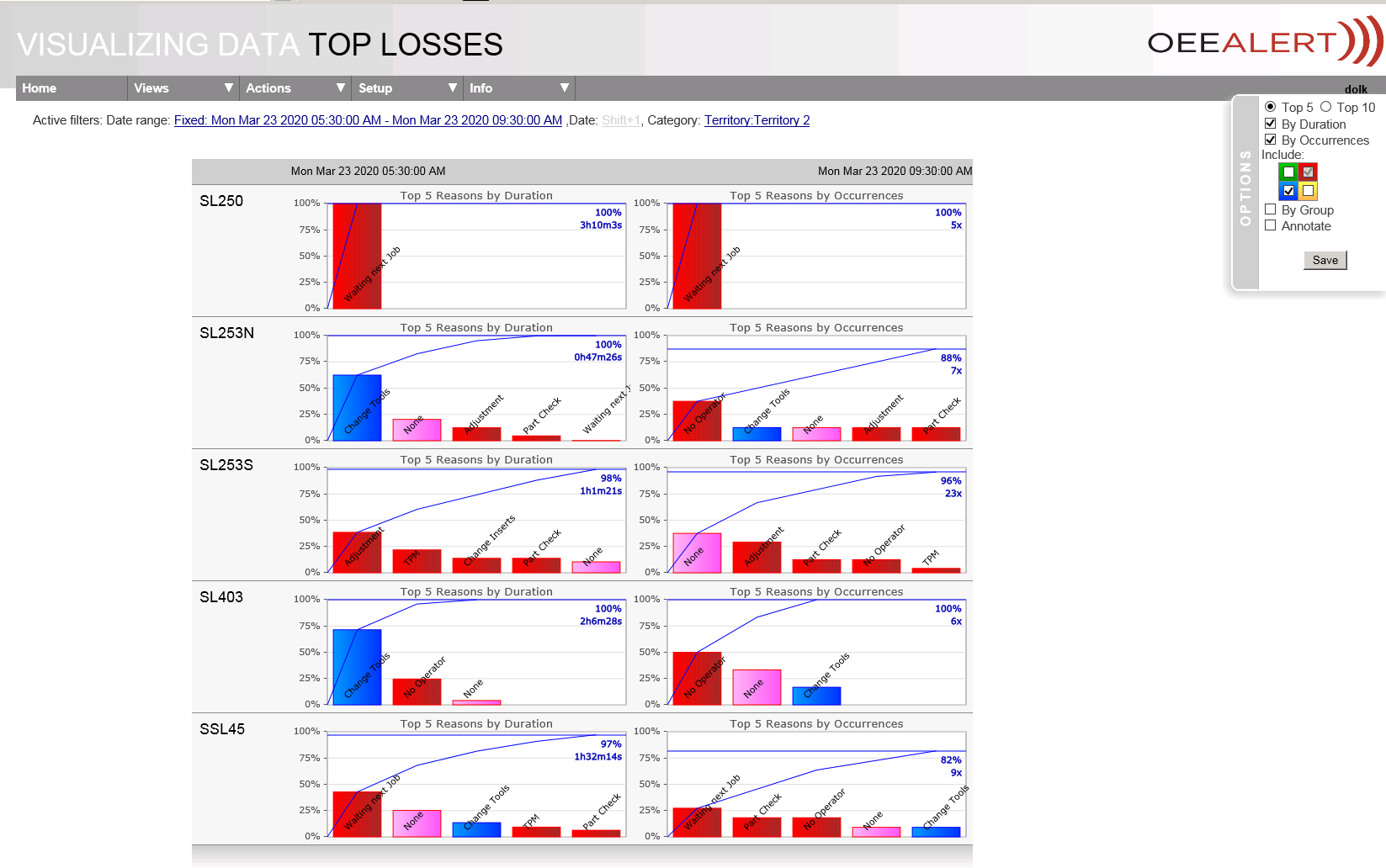
A Pareto chart, where each down reason is reflected by a vertical bar, showing the percentage this down reason contributes to the sum of the losses.
Display View
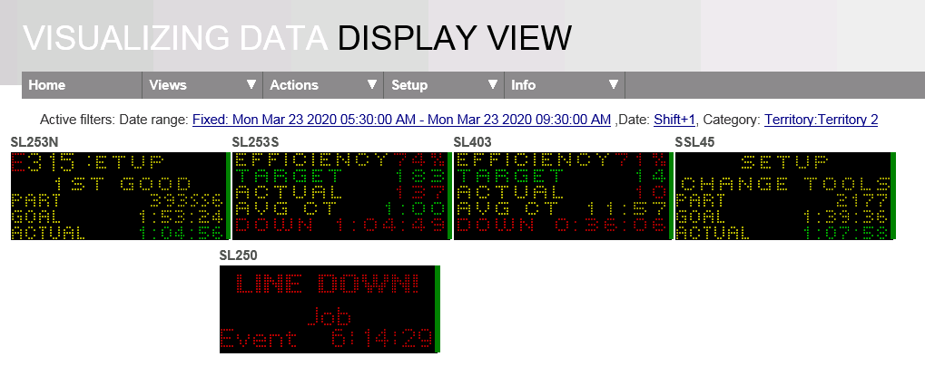
Display View is a realtime display of the actual Vorne XLv1 displays. The displays in the view can be resized and moved around.
KPIs
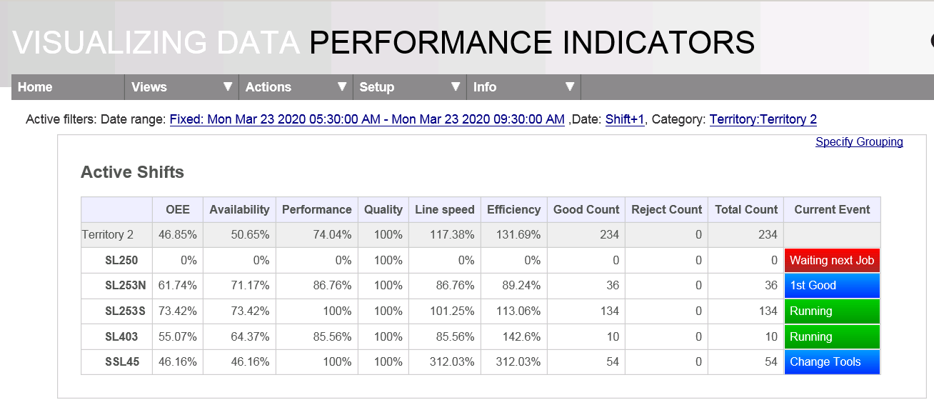
Aggregated KPIs are presented for each hierarchy layer. Provides
OEE, Availability, Performance and Quality for the selected assets,
while offering the ability to group the assets into a hierarchy by
selected properties.
Optionally, counts (good, reject, total) can be included as well.
Andon Display

View all of your devices, realtime, on one screen. Customizable KPIs, as well as current state, reason, Part ID and Shift Interval.
Day At A Glance

Day-At-A-Glance view takes the information displayed from the Hour-By-Hour page and infuses it with context. Alongside the hours displayed, it juxtapositions the events from the timeline stream, so they can be seen in relation to each other.
Dashboard
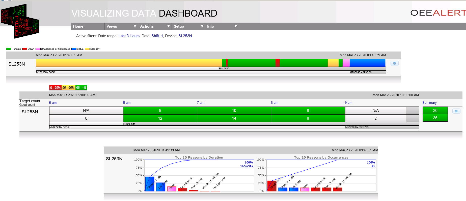
The Dashboard page displays Production State, Hour-by-Hour and Toplosses on one page. Recommended as an Operator Dashboard so that they can see their metrics on one page.